
When it comes to keeping up with design trends, we like to quote Paris Hilton: “That’s hot!”
There are some ridiculously talented agencies doing incredible work, but displaying this prowess for public consumption requires mastering the nimble art of self-promotion. That’s where an agency’s portfolio plays a crucial role. If you’ve created award-winning content for clients, you must be able to capture the process behind the genius design in a way that will draw new customers in.
It’s tricky. You’re basically patting yourself on the back without seeming like a complete braggart. But you don’t want to undersell yourself, either, with a fake aw-shucks humility. The last thing you want is for your portfolio to become an impediment by being too overwrought with special features or so spare that future clients won’t see the value you bring.
According to scientific studies, visual information is perceived by the human mind much better than any other type of content, leaving vivid impressions and getting firmly into one’s memory. That being said, how many striking visual elements does your portfolio feature? If it’s a couple of screenshots accompanied by a bunch of plain text, then it may as well be hampering your business growth and expansion among clients.
Some things are better seen once than heard about a thousand times as they say. Optimized PR campaigns, pre-purchased traffic – none of that will help you collect a client base as efficiently as a good, quality portfolio. Further on in the article, we are taking a look at a number of portfolio websites, each of which is a great example to learn from in terms of both design and UX.
So we’re gifting you a potpourri of agency portfolios with design that crushes. Let this listicle inspire, marinate the creative juices, and propel you to even greater feats. Some of the following resources might as well serve as a prototype for your future ‘business card website’. So get comfortable and draw some agency website inspiration for your own future project.
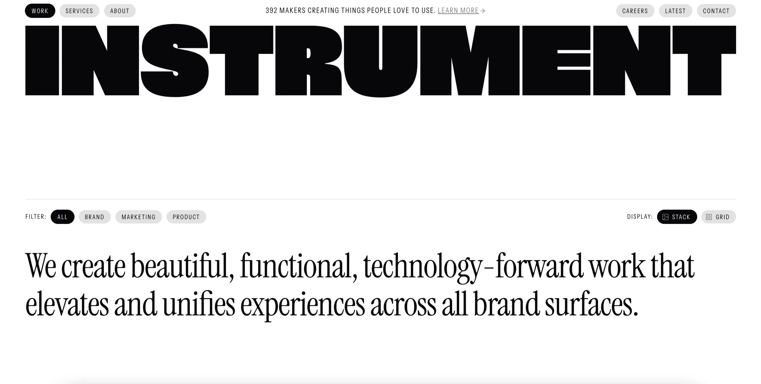
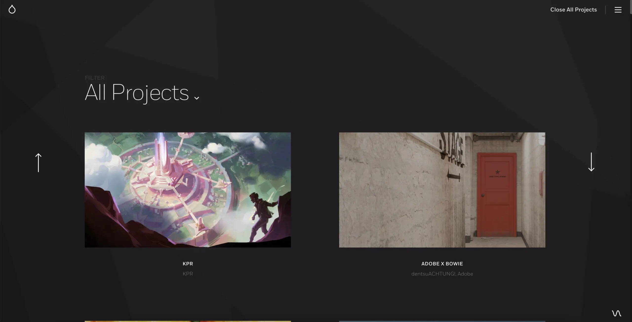
1. Instrument
At Instrument, a digital agency with over 400 employees, their unique approach to showcasing their work sets them apart. Instead of a traditional portfolio, they have a “Work” tab where visitors are invited to “Browse our latest and greatest.”
The playful tone of their agency portfolio reflects their confident cool, fueled by their competence in delivering results. A great agency portfolio, like Instrument’s, goes beyond simply showcasing completed work. It tells the story of their process, client experience, and the birth of their innovative ideas.
One standout example in their portfolio is their work for Salesforce+. The portfolio showcases the project’s strong verbal component, allowing visitors to understand the scope of the project even without visual aids. The text’s typography blends seamlessly with the dominant blue and white hues, bringing the story of Salesforce+ to life. The project, born out of the challenges posed by the COVID-19 pandemic, showcases Instrument’s talent in navigating uncertain waters with creative solutions.
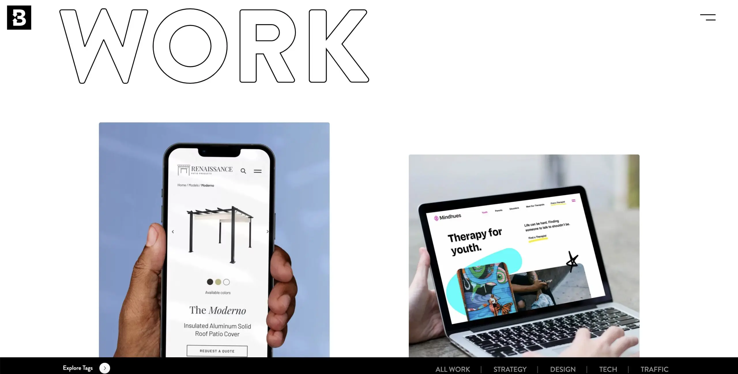
2. Blennd
The digital agency portfolio website of Blennd greets visitors with a bold headline reading “Branding, websites, and beyond,” with the word “work” appearing as a captivating animation slowly reveals more details. On the right half of the page, visitors are treated to a neon blue display of the agency’s website samples.
In contrast to Instrument’s two portfolio examples, Blennd offers a rich selection of sixteen different areas for clients to explore. Each is conveniently tagged with keywords, such as “Logo Design,” allowing for easy navigation and access to portfolio samples and definitions.
As a web design agency, Blennd’s portfolio also delves into important design elements like typography, icons, call-to-action buttons, and user experience considerations. The portfolio includes informative text supported by eye-catching examples, giving visitors a thorough understanding of the design process and why each page looks the way it does.
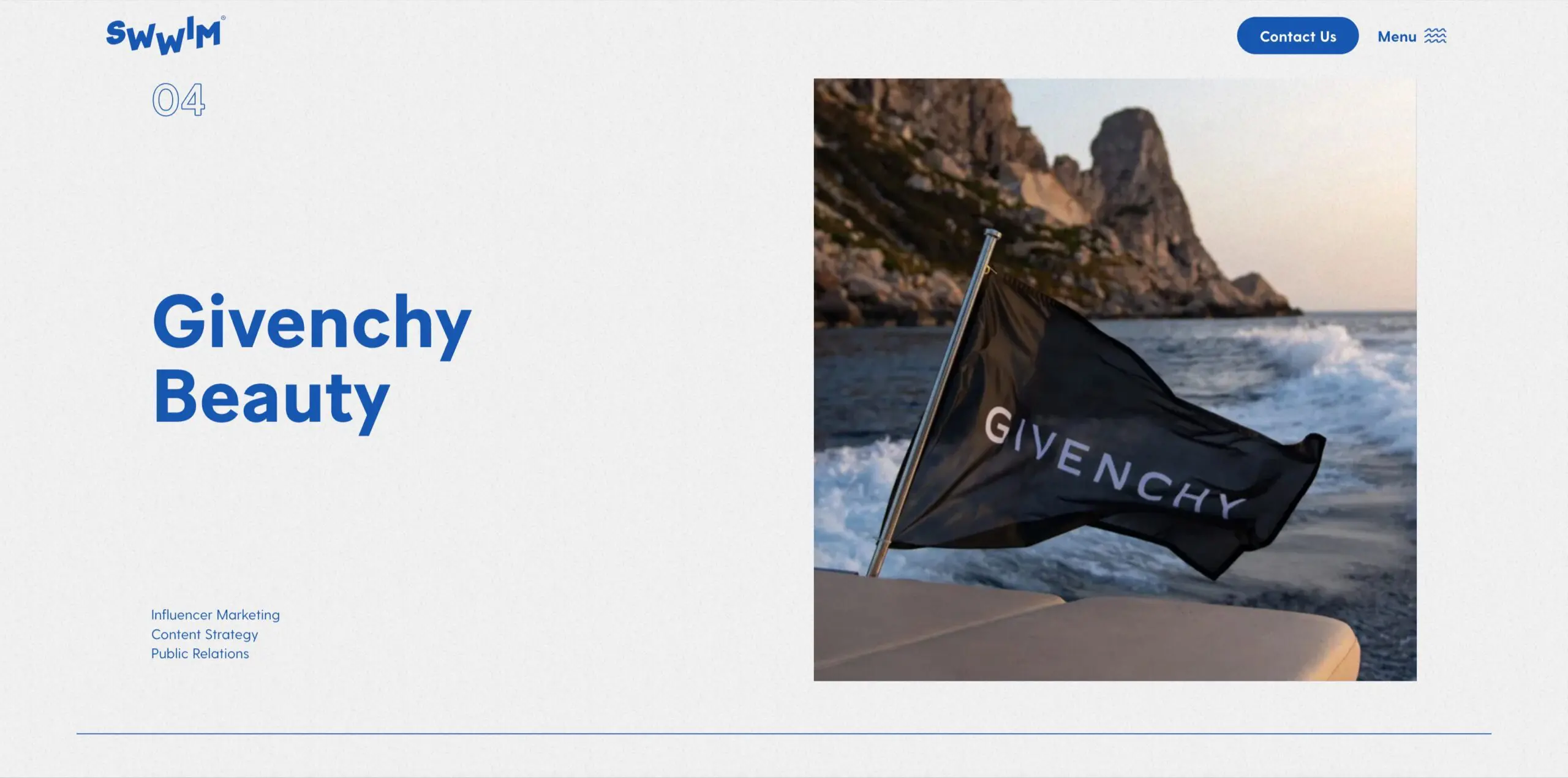
3. Swwim
Swwim is a creative agency specializing in social media, digital marketing, and content creation, and its portfolio showcases its expertise through a series of impactful case studies. The portfolio landing page boasts a playful headline reading “10’s Across the Board,” aligning with the agency’s swimming theme. Visitors are treated to smooth transitions with a rolling blue tide effect as they navigate through the pages.
The case studies are straightforward, presenting a clear explanation of the deliverables along with a visually-stunning array of samples across various platforms. What sets Swwim apart is their commitment to showing clients the results of their work, including detailed analytics on the campaign’s effectiveness. A powerful visual presentation is one thing, but demonstrating an increase in web traffic is truly invaluable.
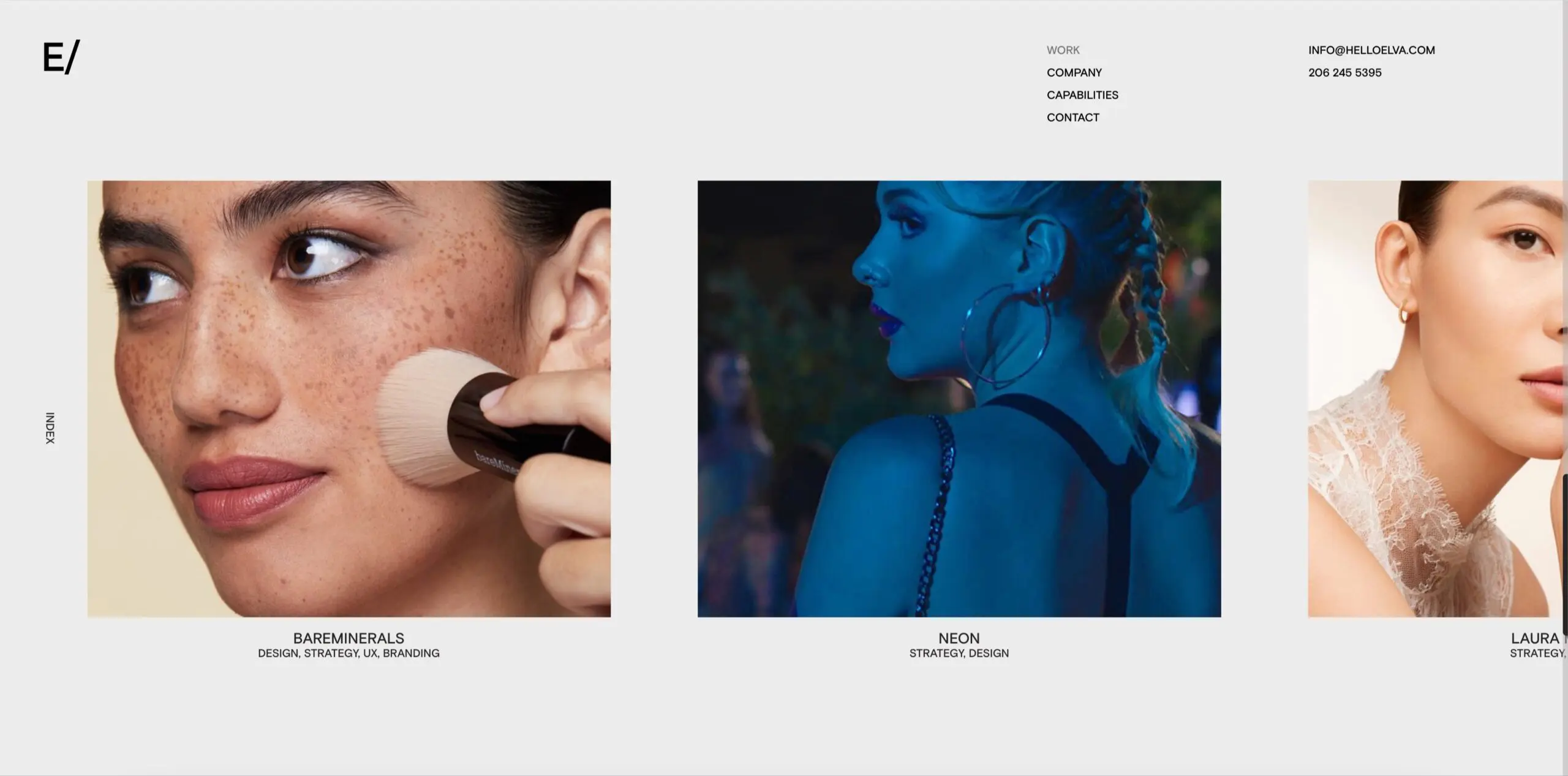
4. Elva
Step into the surreal world of Elva’s design agency portfolio, where creativity knows no bounds. The massive headline “WORK” takes up the entire screen, inviting users to explore the cutting-edge designs that push the limits of what’s possible. Elva’s expertise in ecommerce sites shines through in their sample work, showcasing their mastery of strategic motion in all its forms.
With a focus on storytelling, Elva’s portfolio guides users through the design process, detailing each client’s Ask and the creative Solution that followed. While other design portfolios may delve into technical explanations, Elva places the visual elements of their design deliverables front and center, showcasing their commitment to pushing the boundaries of graphic design and web design.
As you navigate through Elva’s portfolio, be prepared to be transported to a world of static-filled transitions, where the visuals and the creativity know no bounds. From the first scroll, Elva is announcing that they are not afraid to challenge the status quo and create something truly unique.
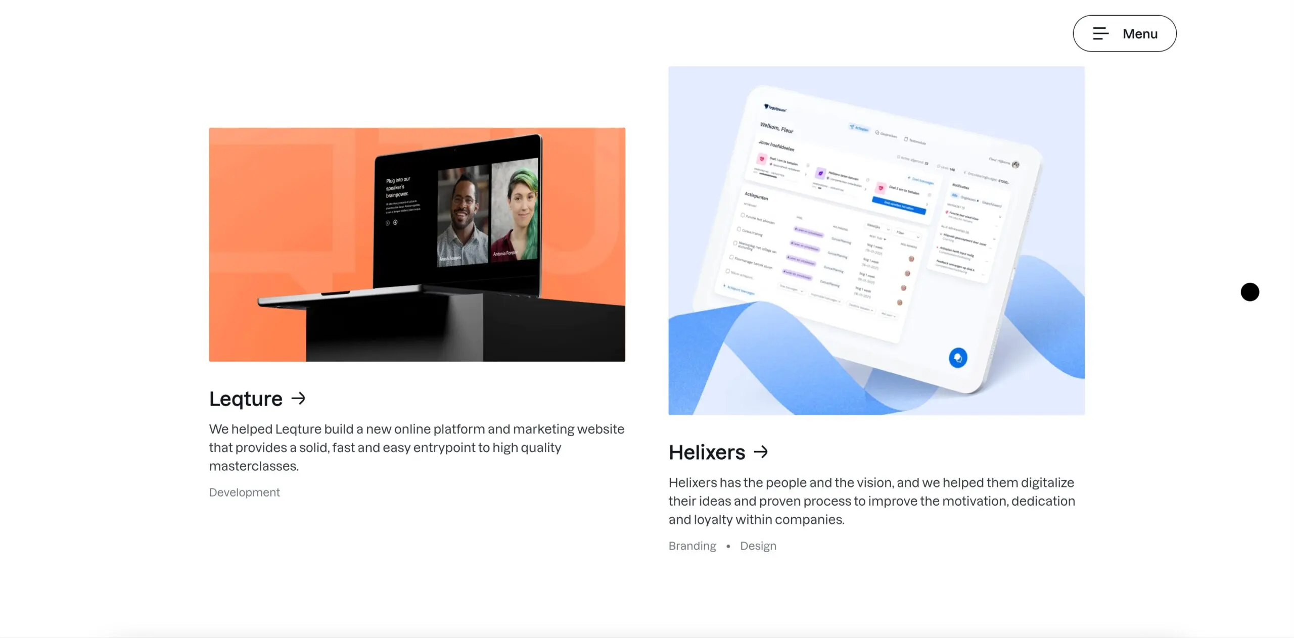
5. Yummygum
Yummygum distinguishes itself in its Projects portfolio by offering potential clients a choice between Development, Design, and Branding options, as well as an Other category. The agency promises “Amazing Digital Products, Full Stop,” and delivers on that promise by allowing clients to go behind the scenes of their projects.
Each case study starts with an Introduction, followed by sections on Challenges and Deliverables, making it easy for users to understand the key issues that the design had to address. For example, the case study for Watermelon, a digital customer service company, showcases how Yummygum helped the client not only with a new website, but also a complete brand overhaul.
The portfolio showcases a comprehensive catalog of typography, fonts, logos, color schemes, and graphics, demonstrating Yummygum’s commitment to delivering “next level” design. The story is told clearly and confidently, with a playful tone and without any distractions from the focus on what the client wanted and what Yummygum delivered.
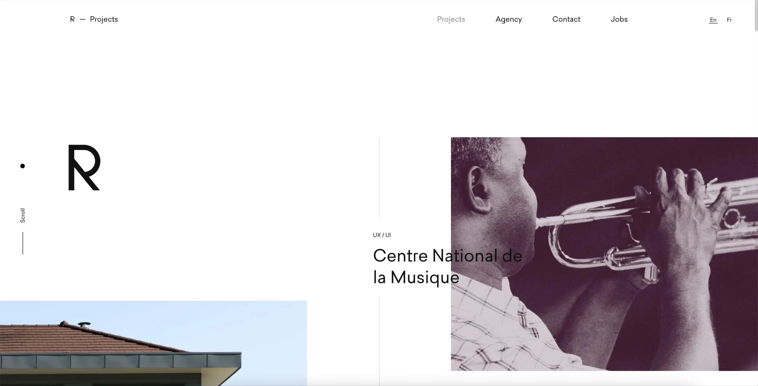
6. Rezo Zero
This French digital agency seamlessly blends contemporary art, functionalism, and the 1920s into its unique agency aesthetic, as showcased in its Projects portfolio. The portfolio features a line down the center of the page, with projects displayed on either side, each identified by a basic deliverable (Website) in small font and job title in larger font. The scroll bar on the left is simply labeled “SCROLL,” reflecting the functionalism that lies at the core of the agency.
Rather than relying on detailed verbal descriptions, the portfolio offers brief project summaries followed by a visually-rich display of images and examples, allowing users to form their own opinions of the quality of the work. The agency boasts a prestigious client list, including the City of Paris, which speaks to the agency’s exceptional capabilities.
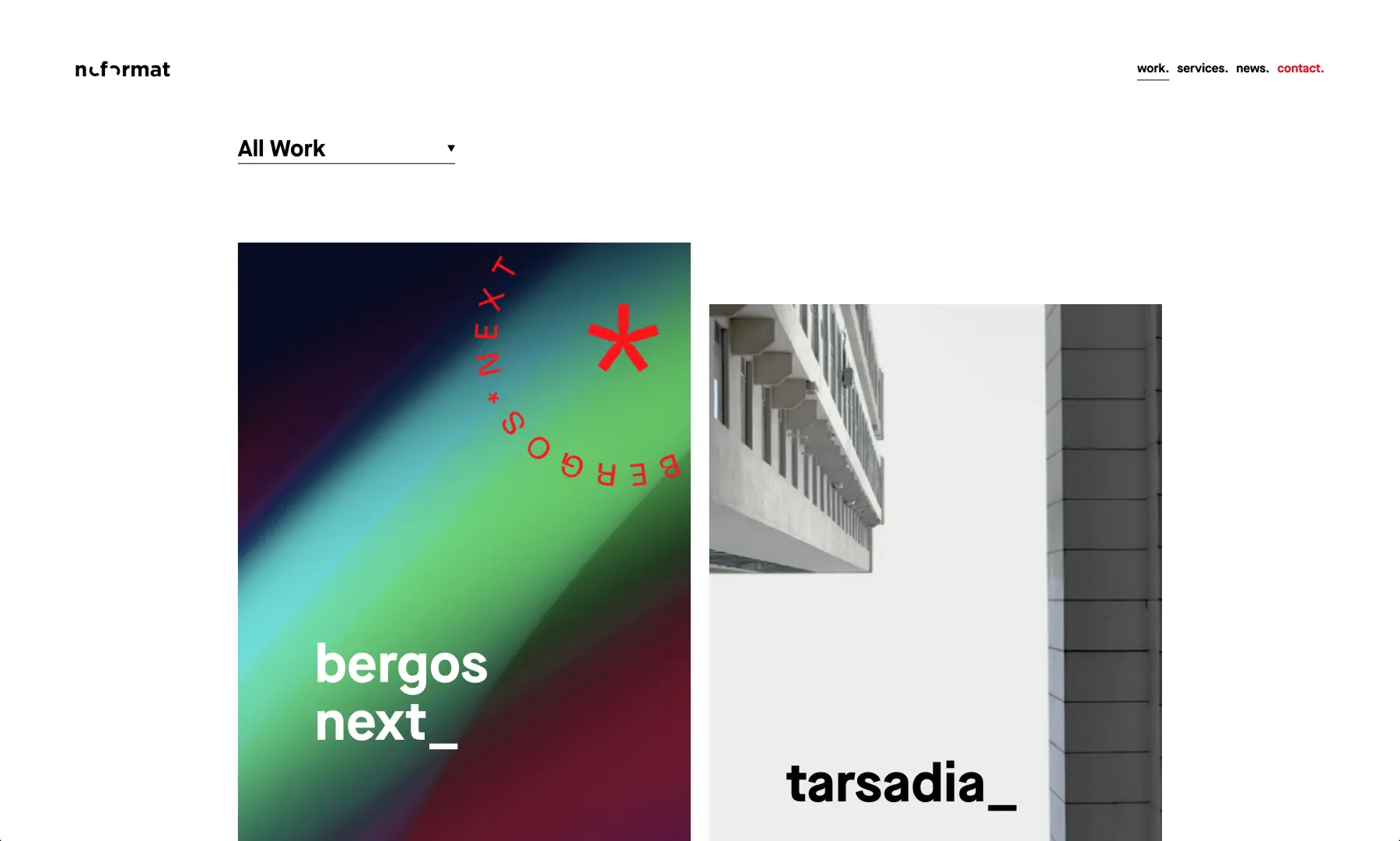
7. No Format
The portfolio design of this agency has been taken to a new level of sophistication, showcasing its expertise in Branding, Apps, Websites, and Social through a drop-down menu on its Work page. Users can navigate through a list of projects, each presented in a large rectangle featuring a central image and bold font. The overall design exudes competence, blending storytelling, artistry, and technical proficiency.
One of the standout projects is the branding for Cloudforce, a Microsoft Cloud migration company, where No Format showcases its skills in delivering “one uncomplicated idea—the dot.” This simple idea is transformed into a tour-de-force of visual brand synergy, with the dot serving as the gravitational center around which the brand swirls in all its forms. The portfolio features minimal text, but what is included is highly relevant and placed among eye-catching samples of deliverables.
For those looking for a master class in showcasing an agency’s vision and culture through storytelling and design, No Format offers a prime example of minimal text and maximum impact.
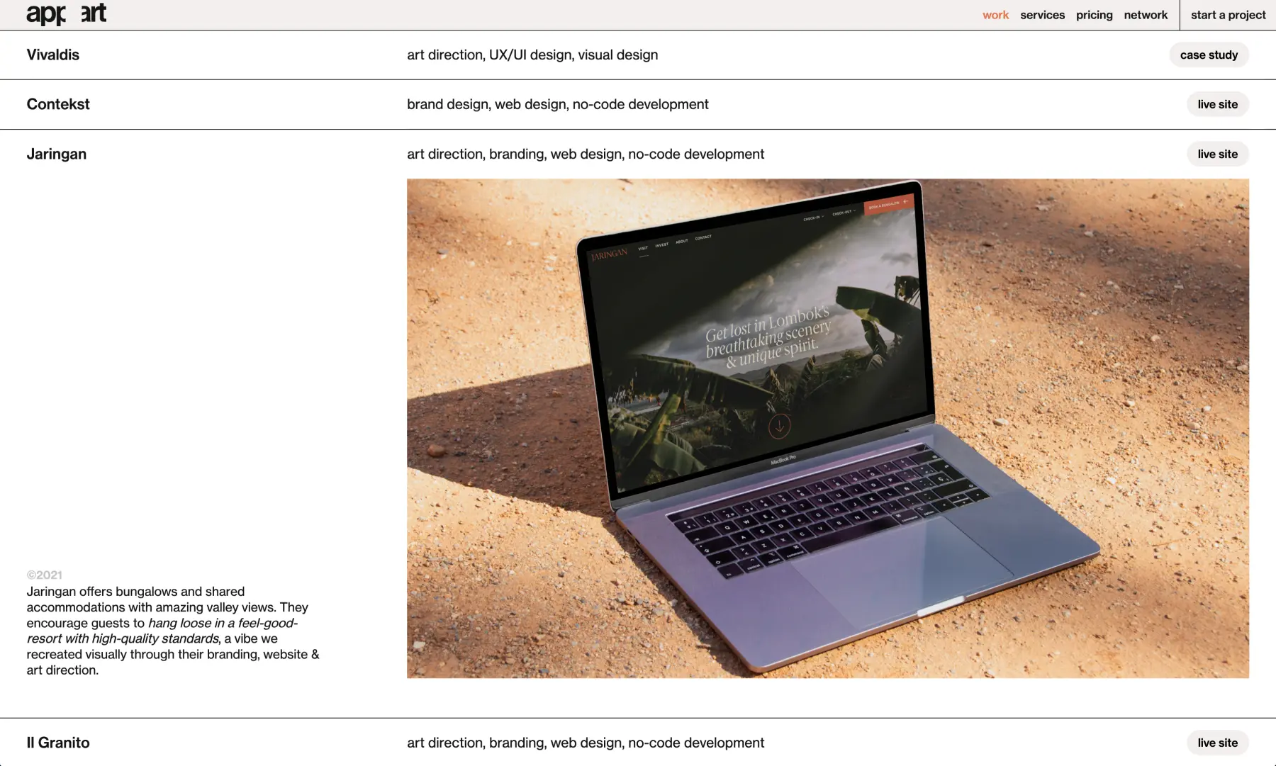
8. Appart
At Appart, their portfolio showcases their unique approach to digital solutions with the tagline “Original in Digital.” The user experience is elevated with an innovative coding technique on the Work landing page, where scrolling down reveals a summary of the first project case study in a seamless and edgy manner.
The portfolio showcases their expertise in React.js through the case study of Vivaldis Payroll, highlighting their UX/UI design, design system, and design motion capabilities. Instead of lengthy descriptions, the portfolio features a glowing recommendation from the client, emphasizing the agency’s ability to deliver outstanding results. Appart effectively conveys their skills and credibility in a distinct and unconventional way.
9. Basic/Dept
“Inspo” and “Brand DNA” are just some of the buzzwords that come to mind when browsing the portfolio of Basic/Dept, a digital agency specializing in e-commerce. Their design seamlessly integrates sleek modernity with a clear brand mantra of “easy to understand, impossible to ignore.”
Navigating the portfolio is made simple with the use of a light mode that gives way to dark mode, providing a visually appealing UI flow that emphasizes the agency’s attention to detail. Basic/Dept presents its work through two main branches, “Services” and “Industries”, each further divided into targeted areas such as “Websites + Platforms” and “Branded E-commerce”. The visual structure of the portfolio resembles the slash in the agency’s name, lending coherence to the entire experience.
While it can be challenging to present a portfolio that effectively showcases both data and branding, Basic/Dept manages to do so by arranging their choices for exploration in an easily accessible and understandable manner. Even for those not fluent in the tech language of Github, the portfolio provides a clear demonstration of the agency’s capabilities. The portfolio includes a visual and verbal centrality that makes for a more logical flow.”
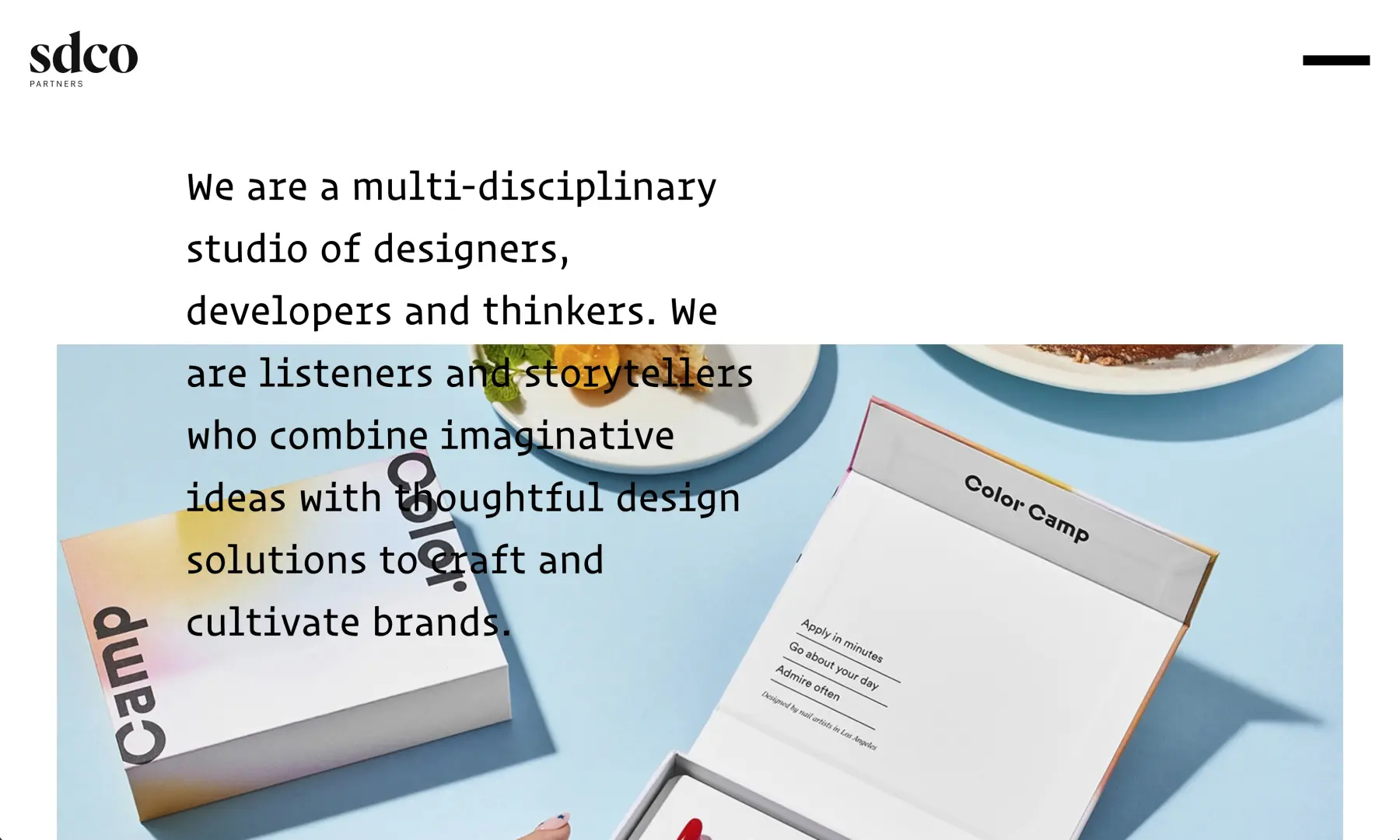
10. SDCO Partners
The past is never really past, William Faulkner said of the South, but this Charleston-based agency has proven the master wrong. Stitch Design has done incredible work in re-imagining the environs of the Palmetto State and has worked on rebranding old hotels and new developments with a very contemporary and elegant flair.
Just getting to the portfolio is an adventure, as the menu is a long, white rectangle that, when you click on it, immediately slides to a 45-degree angle, “dumping” the user into a new space. It’s a feat of visual legerdemain that signals that this agency is playful yet exacting and careful.
The cursor itself is a break with the past, as it is a dot with a plus sign embedded within it. On the Projects page, the categories like Brand Identity and Environment expand when the cursor hovers over the word. A user is then greeted with a large mosaic of images, none labeled until the cursor again hovers. The technique might best be called postmodern, a clear break with tradition.
Each project then details the Capabilities the agency brought to meet the Objective/Solution. The infinite scroll unfurls a parade of images that show, and not tell, what the agency did. What copywriting is included would make any literary Southerner proud..
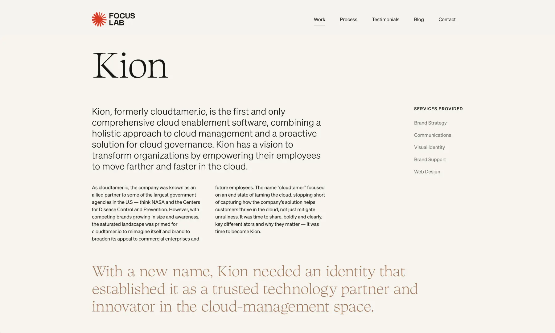
11. Focus Lab
The design of the portfolio of Focus Lab takes a different approach. Rather than an Instagrammy cascade of images, offset with snippets of explanation, words here abound in profusion. There are images aplenty, of course, since visual identity, brand strategy, and web design all rely heavily on what people see.
But Focus Lab provides far more textual analysis of the process the agency undertook to meet the demands of clients. For example, for Real Thread, no image appears in the portfolio until about two clicks of scrolling. What comes first is a detailed examination of the specific landscape and project scope that the project entailed.
In effect, the agency here is trying to establish an intellectual connection to future clients, those who enjoy chewing on the deeper issues that get wrapped into branding strategy. Something like Sustainability as a core value can’t just become a greenwashed image. There needs to be direct engagement so that all visual elements make sense. Focus Lab is showing clients in its portfolio that it has the bandwidth to craft branding as a narration told on many levels.
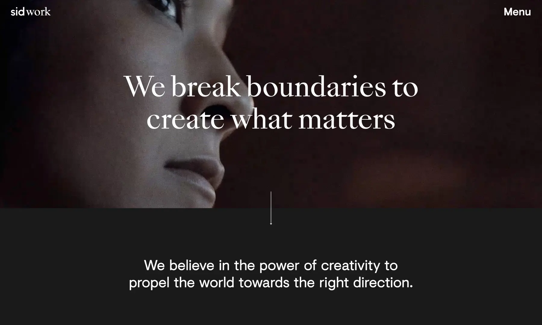
12. Sid Lee
To be the best, you need to beat the best. Sid Lee is one of the most successful creative agencies in the world, with offices in the places you’d expect: New York, London, Paris, Toronto, and Los Angeles. Their portfolio boasts brands that are common household names, and herein lies the lesson.
Just like in show business, there are no small parts – in the world of design, there are no clients so big that laws of creative gravity don’t apply. Sid Lee’s portfolio isn’t designed to rest on its laurels. Their headline is: “We Break Boundaries to Create What Matters,” and in the background are a series of pulsing, high-energy video clips that display the abilities the agency possesses.
The Dos Equis case study shows that no matter the size of the budget, an agency still must deliver. When a company needs a rebrand, it needs a rebrand. Sid Lee tells the story of how they tackled the challenge of repositioning a beer in a marketplace facing tremendous upheaval. While this approach is familiar to most creative agencies, it’s how Sid Lee finishes their pitch that closes the deal: they offer data on how successful they were.
Many portfolios lack this kind of real-world truth. Clients need to know they are spending money wisely. Give them a reason to greenlight the expense. As they say in basketball: ball don’t lie.
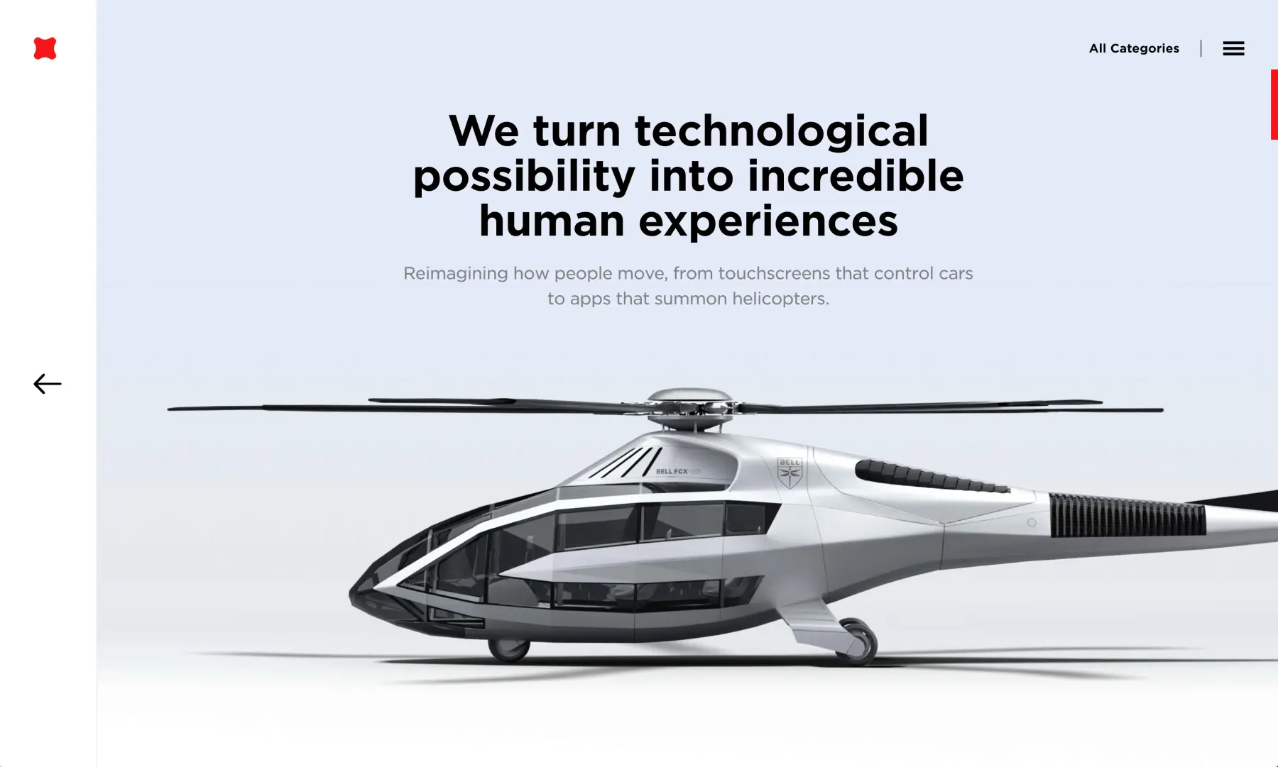
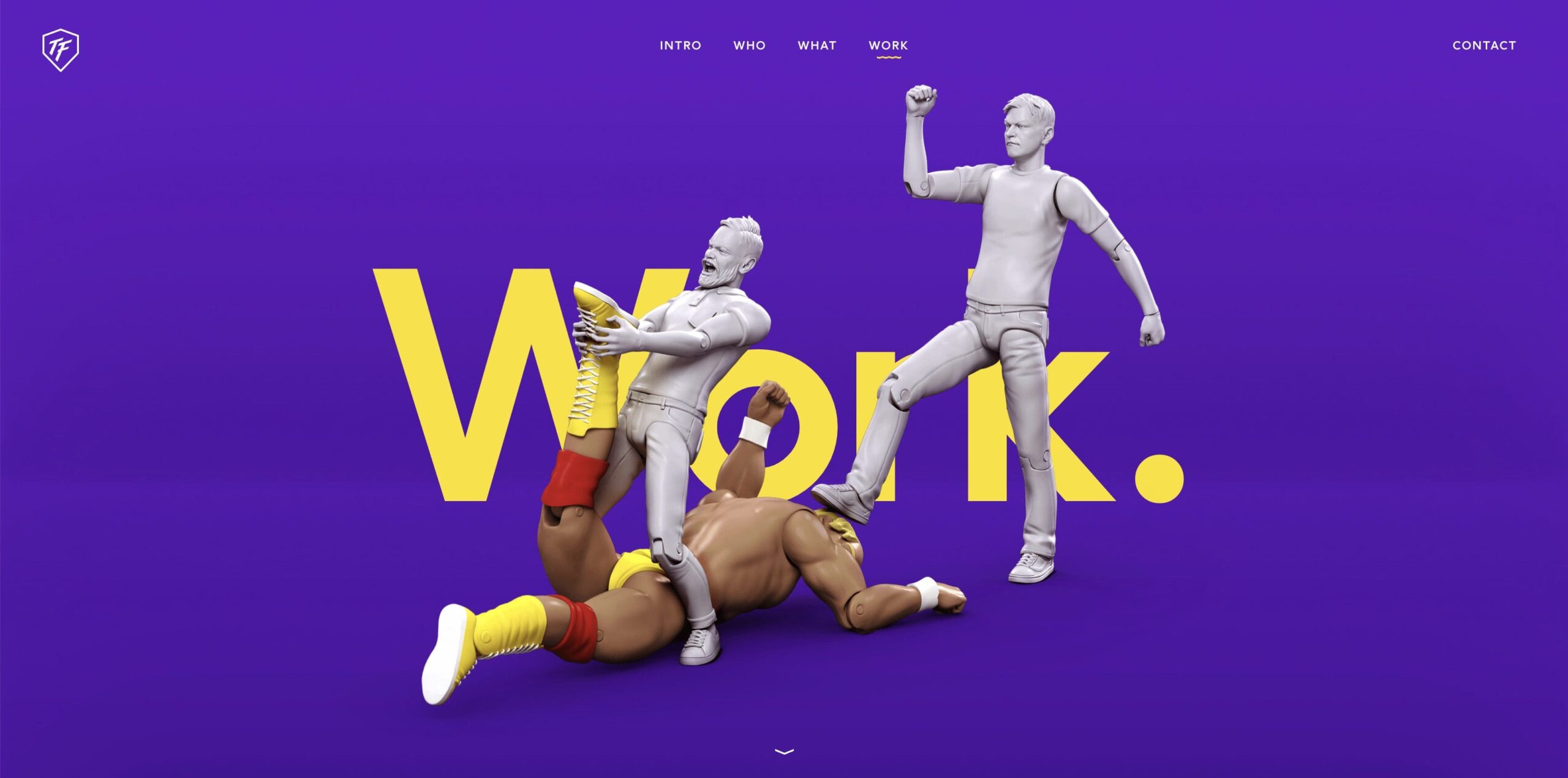
13. Fantasy
Royal Caribbean. Bell Helicopters. UFC. Indeed.
Words seem inadequate to capture the overwhelming dynamism of the Fantasy portfolio. There are thirteen different categories of projects for users to explore. Within each category are projects that Fantasy has completed, usually on a scale that dwarfs the average creative load.
But, after you take a breath, you realize that this portfolio is doing something amazing and also kind of risky. The entire thing, from top to bottom, consists of two elements: video and music. You’re not getting the hero’s journey that often comprises a case study, how a problem was solved through keen insights and creative ideas.
No, no, no. With Fantasy, you’re getting, well, fantasy. You’re getting music that seems to have been composed by Mozart and David Guetta, along with video edited by Quentin Tarantino and everyone who ever worked on Black Mirror. It seems like you should have to pay for the content in this portfolio, the quality is that good.
Perhaps that’s the point. This is all show, precious little tell, save for flashes of verbiage in a video montage. The technical virtuosity is unmatched, and the sheer breadth of what they offer boggles the mind. If the design of a portfolio is supposed to showcase what an agency brings, then Fantasy has done its job very well.
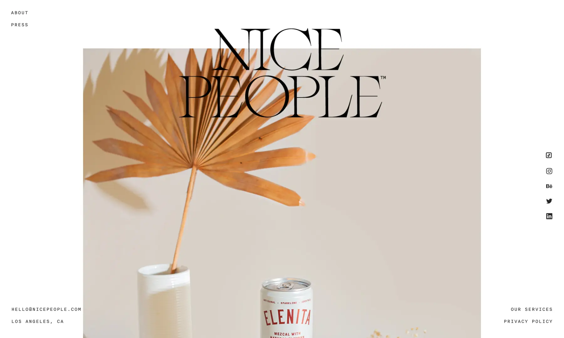
14. Nice People
Do nice guys really finish last? Not in the world of design, thankfully.
Nice People is a multi-discipline agency out of SoCal and their portfolio is unique because it’s located smack-dab in the middle of their home page. There is no separate tab that takes users to it. The company logo remains static as users infinitely scroll through a single column of splashy, colorful images that will navigate to a case study.
Each project begins with a fairly extensive written summary of the specs and deliverables,
followed by all the visual examples that go with branding strategies and website builds. There’s a consistent sunniness to each project, born from California’s weather but also from this agency’s dedication to a philosophy that thinks branding goes beyond logos.
And yes, Nice People wants to work with clients who are nice, but also passionate about what they do. This creative partnership is at the heart of this agency’s mission, and the design of the portfolio captures this sentiment.
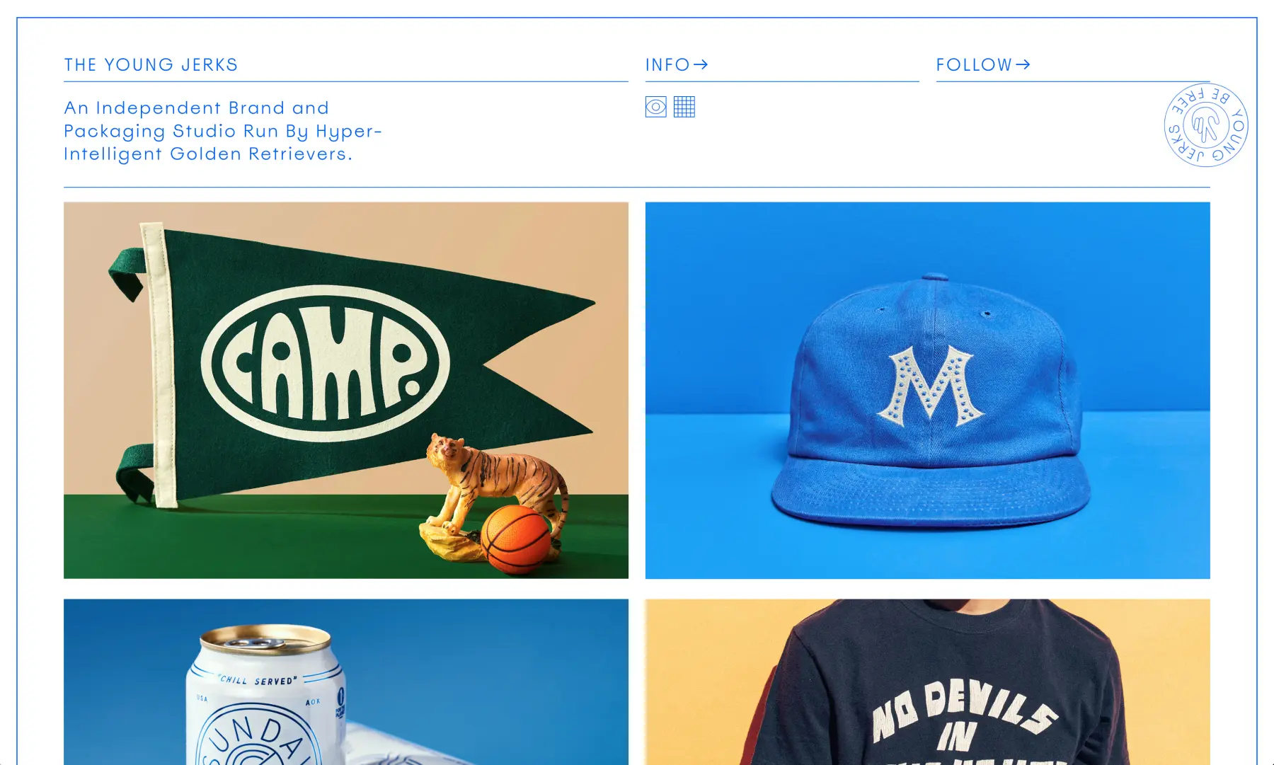
15. The Young Jerks
Be Free.
That’s the mantra of this brand and packaging studio that is based in Brooklyn. Again, the portfolio is the home page. Users immediately see examples of what this agency can deliver, either in product design, logos, or lettering. Scrolling over an image then reveals a brief written description of the project.
The case studies are very visual-centered, with just a few sentences to describe the scope of the work. But perhaps the most notable element of all is in the Info section, which in a very Brady Bunch manner, has a photo of each team member standing in some kind of ironic pose. Scrolling over the pic will yield a name and job title, and for the two founders, Dan Cassaro and Dan Christofferson, are merely called Dad.
This section highlights the inherent playfulness of this studio, along with a moveable Peace Sign that’s also the company’s logo. Users can put it anywhere, a kind of interactive element that creates stickiness. Again, here is a smart way for an agency to advertise its skills without using self-praise.
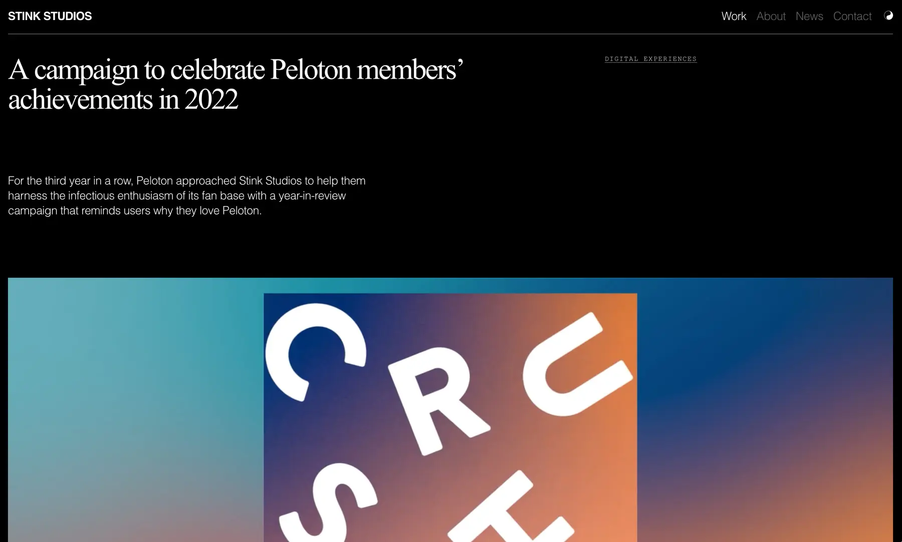
16. Stink Studios
When clients include Google, Nike, and the New York Times, does an agency even need to provide anyone with a portfolio? Of course it does, and Stink Studios delivers a compelling case of how they can “move the needle and the heart.”
Stink emphasizes that it is a studio, not an agency, and it can create in-house the ideas it generates, in whatever form they take. Thus, the portfolio is divided into Creative Campaigns, Digital Experiences, and Brand + Identity. There’s overlap in some instances, but users can search for case studies with a search feature.
What’s most striking about Stink’s portfolio is how horizontal the composition is. Whereas some designs are very vertical in column formation, Stink stresses the “big screen,” almost old Hollywood, approach. Instead of a mosaic of images arranged in stepping-stone order, Stink offers wide vistas, as if users are in a movie theater with a bucket of popcorn. This aesthetic works because much of what they produce are literally moving pictures, and this design aligns with their core values as artisans who pursue excellence.
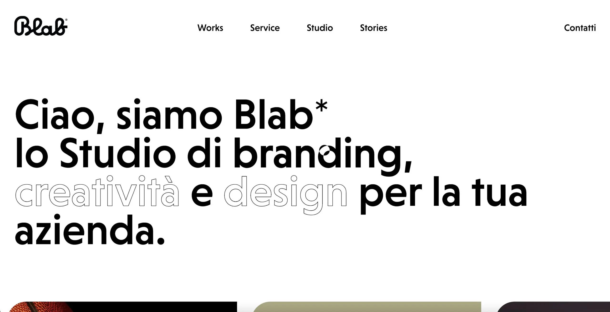
17. Blab Studio
This is the creative agency portfolio implemented with the freshest web design trends in mind: minimalistic overall style, geometric shapes and figures, pastel tones, and revealing animation. All in all, these guys managed to create a really vivid example to take after – a perfect solution for everyone wishing to creatively, strikingly boast their portfolio in 2019.
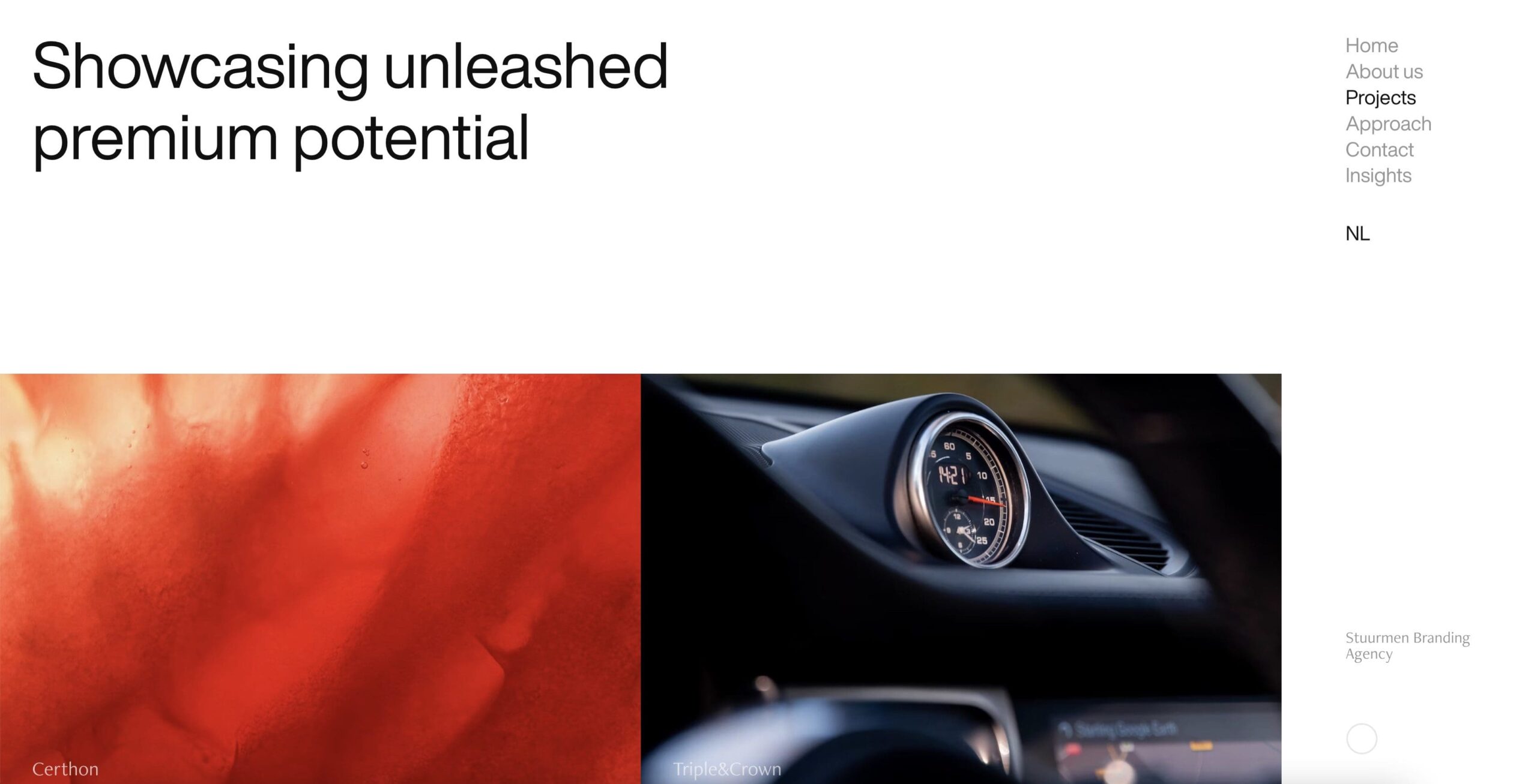
18. Stuur Men
Do you like saturated, acidic color patterns as much as we do? Obviously, only an agency with a strictly-defined target audience can afford to play with such ‘over-the-top’ design solutions (any formal establishments or agencies that position their business formally may as well go past here). This is the choice for someone looking to play with the boundaries of the standard and leave a focused impression on a certain audience.
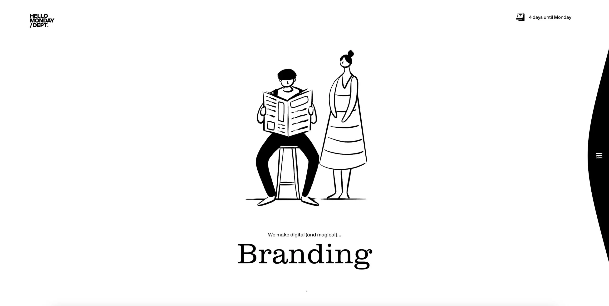
19. HelloMonday
We simply couldn’t go past this amazing digital portfolio. Apart from all the presented projects being impeccable, we also loved the cursor-bound tilting animation that creates a 3D illusion for the whole page. See it for yourself!
20. Brave People
This resource is an excellent demonstration properly fitting in seemingly cumbersome text blocks. Viewing project descriptions from the catalog, you can see one of the most successful examples of ‘cramming all that text’ in with screens in an organic, highly-efficient manner. You can feel at once how much creative work was put into achieving this one.
21. Resn
Despite the moderate collection of color schemes this portfolio features, the overall approach is certainly worth checking out. There aren’t many case galleries that make descriptions go along perfectly organically with everything else on the page. The design of this one may be the best way to go for those working with an extended scope of services and tasks that go beyond visual design.
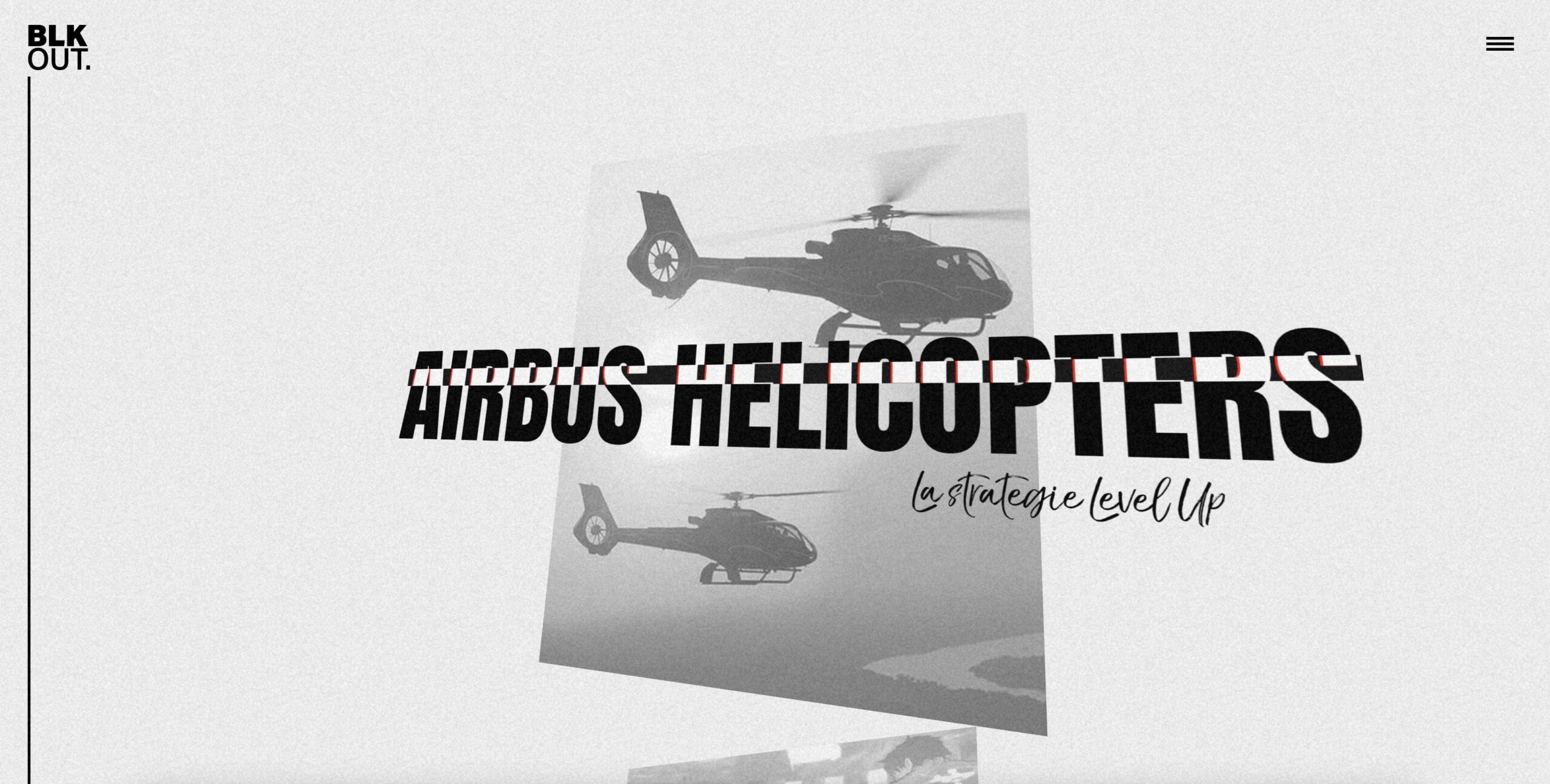
22. BLKOUT
This is the resource that literally amazed us with confusion. Once you open this portfolio’s homepage, all that you see is a black-and-white concept of a TV screen filled with white noise. After you click and drag some interactive elements, you understand how amazingly well and tasteful everything is put together on this website. An awesome, original concept implemented with as awesome technical input.
23. ToyFight
You must see this one with your own eyes – you are met with quite a peculiar homepage illustration continued by a list of exhibited cases that is scrolled through peculiarly as well. If you seek originality, here’s a bunch of it – take a look and get inspired for some wild, out-of-line ideas.
24. Active Theory
Grey, moderately-colored background, blurred letters… What can attract potential clients here, you might ask. The design of this digital portfolio beams with melancholy in the best, warmest way, while also demonstrating the designer finesse of artists that created this solution.
25. Noescumon
Everything’s pretty standard in terms of the UX here: you see a bunch of project names with respective ‘+’ symbols, clicking which, the project description gets expanded. The raw digital font-focused design is the best – it is as though all the text on the page was composed using a typewriter. The taste and optimal conciseness of this design creators’ can be felt when viewing this page – there are no excessive dynamic elements involved.
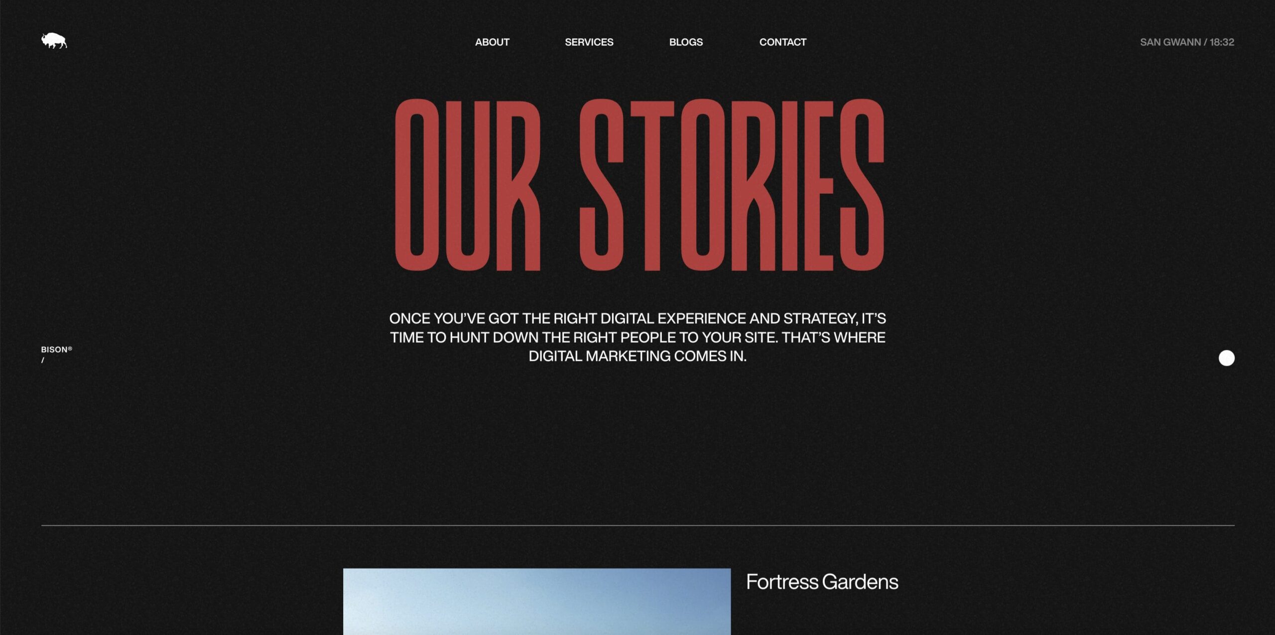
26. Bison Studio
Don’t forget to think about your cursor while you draw some portfolio websites inspiration – with this here resource, for example, you wouldn’t see your ordinary arrow. Instead, you use a laser sight as your trusty pointer – like a real sniper! In all the other aspects, everything’s done with just the right amount of professionalism here – each project sample is accessible to view and returning to a root catalog is fast and easy.
27. Diplo Studio
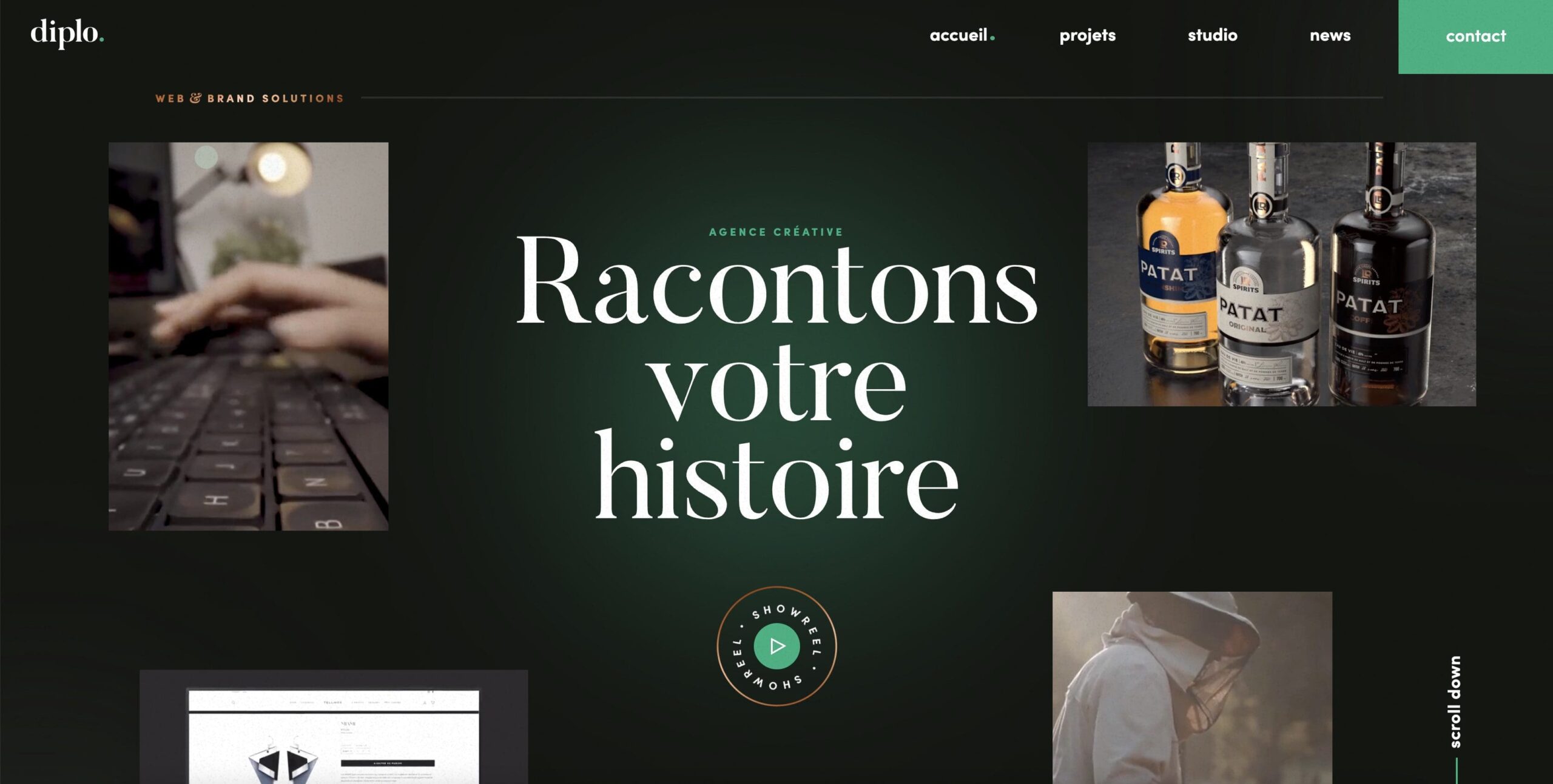
The digital portfolio on this resource is the factual proof that even the most moderate concepts can be executed strikingly. Designers made a bet on the classic color scheme choice (darker tones hint on the high qualification of the company) along with some minimalistic animation that becomes ‘alive’ once the cursor is moved over the case tile.
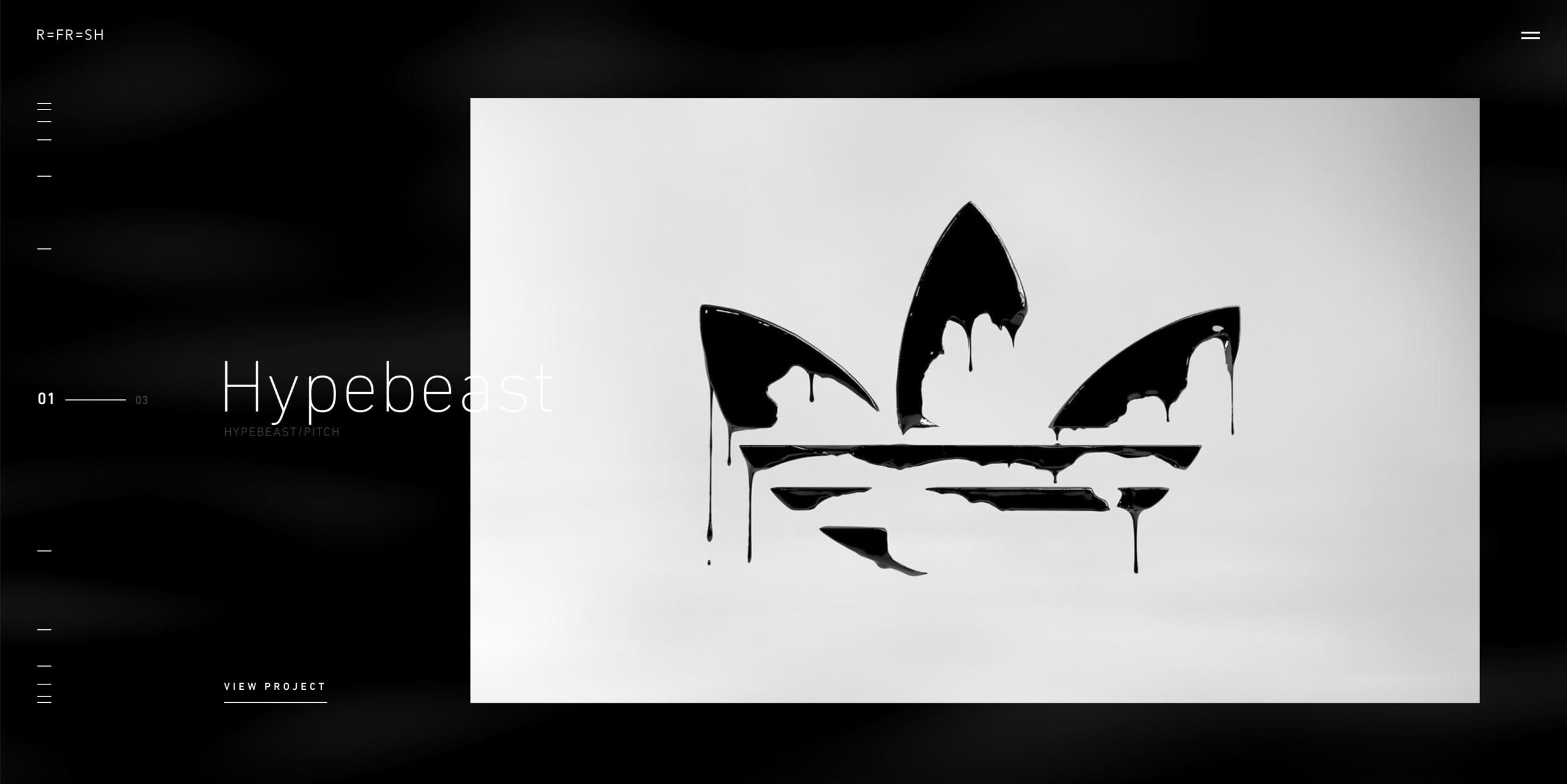
28. Refresh Studio
Refresh Studio’s portfolio made the unfurling of project tabs resemble the graphics from ‘Transformers’ – everything moves very gradually and all the moving elements can be seen in detail. While the page loads, you can see things appear meanwhile, making the UX seamless at no expense of the required loading time.
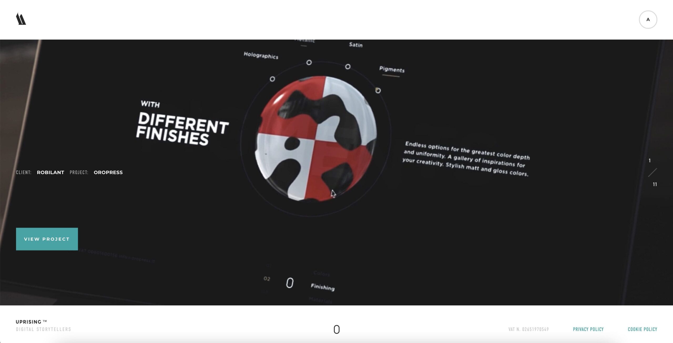
29. WeAreUprising
A great thing about this site is that it has sound. Beware though: launching the website all alone in the dark may result in goosebumps all over your back. As die-hard fans of horror movies, we enjoyed the color scheme and psychedelic animations. Although, such solutions would hardly fit the taste of a mass consumer audience.
So, are you ready to take your designs to the next level? Trust Hey Reliable to bring your vision to life with seamless HTML/CSS, React/Vue, WordPress, Contentful, or Craft CMS coding. We’re here to make your animation ideas a reality, matching your designs exactly and delivering the final product with precision and care. Say goodbye to the headaches of coding and hello to the peace of mind that comes with partnering with a company that truly gets it. Let’s bring your designs to life and make your brand stand out.
YOU MAY ALSO ENJOY