


What can you do if your website doesn’t attract customers? One option is to create a completely new website. It is a long process that will require a lot of time and investments. However, there is a less radical way – improving the design of your existing website.
Do you want to learn how to make your design engaging? In this article, we will share 25 amazing ways to improve website design.
Reasons to Work on Website Design
According to Gomez, 88% of visitors abandon a website after one negative experience.
A well-designed website is:
- easy to understand;
- useful;
- aesthetic;
- engaging.
Therefore, if you suffer from a low conversion rate or negative feedback, we strongly recommend considering website improvement. There are numerous factors to revise, and we will describe most of them in detail.
25 Tips on How to Improve Web Design
In short, your website should provide visitors with a fantastic user experience. It should have excellent usability, allowing users to easily navigate between pages. And make sure that the website provides trustworthy information and supports your customers.
Now, let’s discuss how to do it in practice.
1. Simplify the Navigation
You can think of navigation as of a map that shows your visitors places to go. A complicated or disorganized interface can confuse your users and even make them leave unsatisfied. Limit your navbar feature to a few important sections.
2. De-Clutter Your Web Pages
Don’t hesitate to delete minor elements that can free some space. In fact, the unoccupied area on your webpage increases the readability of your page. Use white space to emphasize key elements and improve user experience on the website.
3. Make the Pages Look Consistent
You should design every page using the same structure, elements, and color scheme. If your website consists of mismatching pages and sections, it will confuse visitors, hurting conversions. If your website consists of mismatching pages and sections, it will confuse visitors, hurting conversions.
4. Follow The ‘One Color’ Rule
Too many colors on one webpage may look a little childish. We recommend using only one dominant color for the whole website and completing the design with complementary colors. Such an improved design will look more aesthetic to viewers.
5. Don’t Make These Common Font Mistakes
It may be tempting to use very creative fonts, but they may be less readable than you think. Another mistake is to use many different fonts: this can confuse your users. Limit yourself to two fonts so they won’t drive attention away from more important elements. Here, we recommend reading our Google Fonts pairing guide to get some useful tips on the topic.
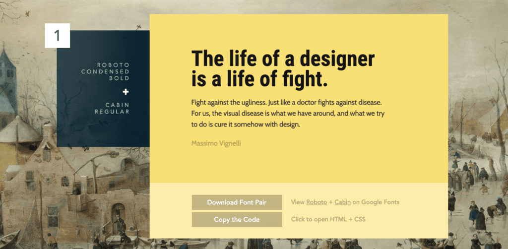
Font pairing example
6. Stock Photos Are Out. Genuine Photography Is In.
Stock photos seem an excellent source of great images. However, they can become the downfall of a website. Too obviously “stocky” images won’t evoke trust in the company, they may even raise suspicion in its genuinity. So, minimize the number of stock images you use, and remember that they should be as realistic as possible. Just take a look at this example of an obvious stock photo.

Unrealistic Stock Photo
So, minimize the number of stock images you use, and remember that they should be as realistic as possible. Here is a better image that looks natural.

Looks better, doesn’t it?
7. People, People, People
The easiest way to deal with the stock problem is to fill your website with photos of real people. Use portraits of your employees working in the office, because they will look much more realistic than any stock image. Just make sure that these photos are of high quality.
8. Reinforce with Illustrations
What if you don’t have a lot of real photos for your website? Try to add some custom illustrations to make your style unique. Find a good designer to draw original and creative pictures that will catch people’s attention. Search dribbble.com for amazing freelance illustrators worldwide.
9. Use Multiple Kinds of CTAs (Calls to Action)
After scrolling through your content, people expect to start interacting with your company, and CTAs should help them identify what they can do next. Make sure that you offer visitors more than just a trial or a consultation. Engage users to browse your services and get more familiar with your brand for establishing friendly communication in the future.
10. Do Not Hide the CTAs
Make sure that all your calls to action are easy to find. Make the CTAs bold, emphasize with color, or create a button. Just don’t bury them somewhere in the corner. Check out some webpage examples that feature well-positioned CTAs.
11. Improve Page Loading Speed
The time your victors spend on a webpage strictly depends on website speed. Slow webpages have a low conversion rate and fewer customers. In this case, improving website design may help. The first step here is to reduce the number of files you use by combining them. Also, remove unnecessary formatting and code so you can reduce the files’ size. Make sure that your CSS and JavaScript load asynchronously so the browser can display the first elements before the entire page is loaded. Finally, to improve server response time, choose a provider that offers higher DNS speed.
12. Prioritize Scrolling over Clicks
Keeping all information above the fold is a bit of an outdated habit. So, improve web design to feature longer pages containing 3-5 sections. That will create a seamless experience helping users to explore more aspects of your business without clicking.
13. Use the Fold to Catch Attention
Remember that even if you make a long scrollable page, the top area is where the people will look first. Fill it with a CTA, some proposition or a statement that will clearly inform visitors about your brand. Just look at the example of ReliablePSD, we used above the fold area to explain what we do and what we are good at and spiced things up with 3 CTA buttons.
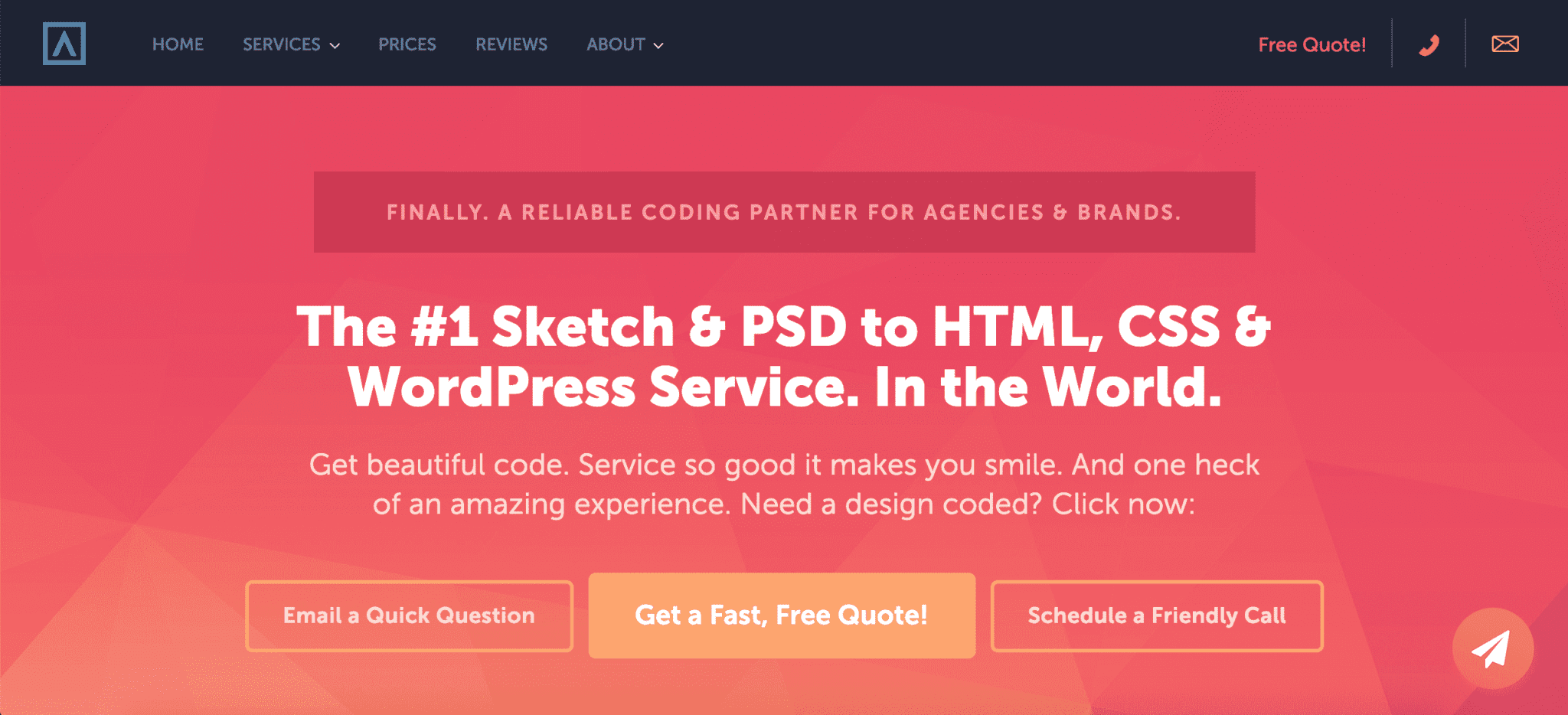
ReliablePSD main page
14. Prioritize Items in Lists
When it comes to lists, the most important thing is to keep from overloading them with tons of options. Try to use short lists representing only valuable information. What is more, prioritize the items to draw attention to the most valuable ones.
15. Fewer Choices – Better Conversion
It may be tempting to display all your offers on one page, or to create an extremely detailed menu. However, the more options your users have, the more time it takes them to make a final decision. If you don’t want to confuse your customers, limit the number of choices you offer.
16. Keep Language Simple
One way to spoil a website is to overload it with content. Try to avoid bulky text blocks, complicated phrasing, jargon and ambiguous terminology. Structure your content in smaller paragraphs that contain only valuable information and are easy to read.
17. Connect the Webpage with Social Networks
Do not underestimate social media power. Simply adding a “Share” button will give your customers an opportunity to tell their friends about your brand. Make sure that these buttons display all social networks that your audience may be using.
18. Be Careful with Sliders & Animations
In general, animations can improve user experience, for example, by entertaining visitors while the page is loading. However, some animated elements like carousels can slow your webpage without any sufficient engagement increase. In fact, this is true for other moving elements such as sliders, tabs, or accordions, so try to avoid them if possible.
19. Make It Easy to Contact You
In fact, the contact page is one of the most important elements of the entire website. Whether you place contact details in the footer or create a CTA button, make sure that it is accessible to users. Give customers a way to call, text, email, and fill out a form. Different people prefer different methods.
20. Include a FAQ That Sells (Here’s How)
Your visitors may want to know more about the company you represent. Therefore, you should create an FAQ section of answers to the most common questions. However, don’t just describe facts your customers already know: use this space to help your clients, persuade them to buy your product, and evoke trust in your company. For example, include “How does the free trial work?” to remind clients about your offer, and “How much can I save?” to highlight the product’s benefits. “Why should I choose it?” will give people another reason to become your customers. Remember to update FAQs regularly, as you need to feature all changes on your website.
21. Pay Attention to Mobile Experience
The number of mobile users continues to increase, so you should optimize your website to support small smartphone screens. The first thing is to avoid small elements, because people hate having to zoom in to tap a tiny button. Make your design simple, reduce the amount of content displayed at once, and highlight the most valuable elements such as CTAs. And be careful with the images you use because photos with many small details can leave mobile viewers confused.
21. Optimize for Different Devices
Some people will visit your site using a laptop, others will browse the pages from a tablet or smartphone. So, how to improve a website to suit all your users? Organize your webpage into a fluid grid that will resize all elements proportionally to the screen size. Notice that attention spans vary for different devices, so use different arrangements for a desktop and mobile view. Regardless of view, style all the elements to fit a fingertip on a touchscreen, because even some laptops are equipped with them.

Don’t forget to optimize!
23. Keep Testing
Even if you think that your webpage has a great and intuitive design, you still need to test it on real customers. Perform tests with Google Analytics to see your conversion rate and other valuable data. Find out where your users click and what elements aren’t getting attention using Mouseflow. Conduct A/B tests, for example, at Hiconversion, to check different webpage versions. Repeated testing will grant you valuable insights on how to improve your website even more.
24. Look for Broken Links
If you have a big website with a variety of pages and sections, there are chances that some links may not work. Try to catch them and improve as soon as possible.
25. Review Your Web Design Regularly
And last but not least: don’t stop after you’ve finished designing the first version. The design trends will change over time, so keep updating your website according to the latest tendencies. Remember that only consistent reviewing will help find the problems and follow the trends.
Checklist: How to Quickly Improve Your Website
You may be overwhelmed by the number of things to do. That’s why we have prepared a short summary that will guide you through your website improvement.
| Key point | To-do list |
| Navigation |
|
| Content and visual elements |
|
| Design consistency |
|
| Engagement |
|
| Organization |
|
Frequently Asked Questions about Web Design
While reading this article, you might have faced some unfamiliar terms. Here are the answers to some popular questions to make things clear.
What is a CTA?
Call-to-action is a small text or image that attracts attention and persuades people to perform certain actions. A CTA can be placed on a button, text link, form, etc.
What are stock images?
A stock is a source of high-quality professional photos that can be purchased and used for personal and commercial purposes. Stock photos help to visually attract people to your product, creating an engaging website.
What images can be called high quality?
For a website, photos with 2-5MP will work great, because they will suit an average laptop screen (1500-2500px). You can use images with even higher quality, but viewers won’t spot the difference.
Which fonts are the most popular?
In fact, default options such as Arial or Helvetica are among the most used fonts. However, if you are looking for a less common solution, try Oswald or Open Sans in your project.
What’s the difference between UX and UI design?
UX stands for user experience, while UI means user interface. These terms are often misused. UX design aims at optimizing of interactions between users and a product, helping people explore the platform. At the same time, UI design is responsible for website representation, making it look aesthetic and engaging.
Where can I see new design trends?
You can browse the web to find video guides and articles on modern design tendencies. Remember that big companies always follow the best practices, so visit their websites for inspiration.
What is a conversion rate?
In general, a conversion rate is a percentage of users that completed a desired goal compared to the total number of website’s visitors. The goal can mean filling in a form, buying a product, leaving contacts, etc.
How do I measure my conversion rate?
The formula for the conversion rate is simple:
Conversion rate = (active users / total users) * 100%
You don’t need to calculate it on your own: many analytical platforms like Google Analytics can do it automatically.
How do I know if my website is performing well?
There are a lot of tools that can help you track your website performance. One of them is Google Analytics, which is a powerful software to determine conversion rate, ad performance, bounce rate, and much more. Try HubSpot Website Grader to learn more about your site’s loading speed, size and security. Also, you can check your SEO optimization with the RavenTools auditor which can grant you many valuable insights.
Why isn’t my website generating more customers?
One possible reason is that your website may lack targeting. Make sure that you know your audience before designing your website, and choose appropriate style and content. Also, focus on fulfilling your client’s needs and prove that you have a solution for their problems. Finally, do not just try to attract new customers, try to turn them into regular clients. Make people return to your website by offering them new services, updating the content, and providing a great experience in general.
Conclusion
Good design can sufficiently improve your customers’ experience. By improving website design you will not only make it more appealing and interactive, but also change the customers’ perception of your brand.
One Last Thought… Don’t try to add all these tips all at once! Start small. Pick just 1 or 2 at a time. Before you know it, you’ll have a high-performing, high-converting website that rocks.
What is Reliable PSD?
If you need help converting your PSD designs to HTML or CSS, Reliable PSD is indeed your trusted partner. Hundreds of different digital agencies worldwide, who require real quality above all else, trust us with their most important projects. If you’re wondering why, it’s purely because we carefully deliver high quality results that are extremely rare to come across. Our mission is to give agencies peace of mind and confidence. We’d love to help you too. Reach out to us for any of your development needs.